Stock Chart Indicator: Moving Average Convergence & Divergence
The basics of MACD and how to use it for your trades.
Let’s get down quickly — so where are we? When trading, you’ll most likely use technical analysis to determine which assets to buy and which to sell. The technical analysis simply tells you what is the current sentiment in the market — is it bullish or bearish? Will that change? And such. In doing so, there are many indicators under the technical analysis that provide you with insight into the sentiments.
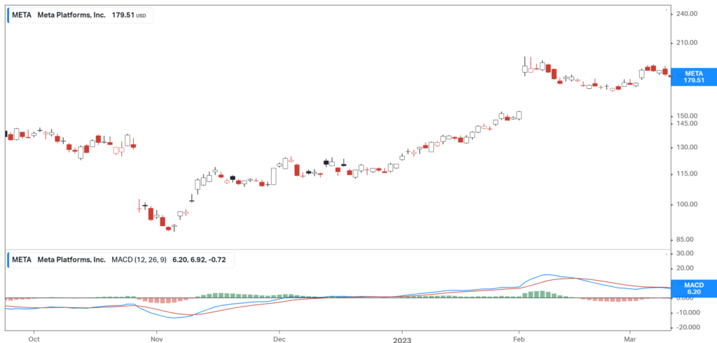
The Moving Average Convergence & Divergence (MACD) indicator is a popular tool used by traders in financial markets, such as stocks or cryptocurrencies, to identify potential trends and momentum shifts. It consists of two lines, the MACD line, and the signal line, as well as a histogram.
The MACD indicator provides traders with a few signals:
Convergence: When the MACD line crosses above the signal line, it generates a bullish signal, indicating that the price may be turning upwards. This suggests a potential buying opportunity.
Divergence: Conversely, when the MACD line crosses below the signal line, it generates a bearish signal, indicating that the price may be turning downwards. This suggests a potential selling opportunity.
Histogram: When the histogram bars are above the zero line and increasing in height, it suggests upward momentum and strength in the buying pressure. Conversely, when the histogram bars are below the zero line and decreasing in height, it suggests downward momentum and strength in the selling pressure.
By observing these signals and the behavior of the histogram, traders can make more informed decisions about when to enter or exit positions in the market. However, it’s important to note that the MACD indicator should be used in conjunction with other technical analysis tools and indicators for a comprehensive trading strategy.
How is it calculated?
Now, before we start, you don’t actually have to know how to calculate it for you to place your trade but knowing it would give you a certain level of understanding of the system, and why this indicator is used. Just in case you feel like you don’t want to be bothered by this mathematical rigmarole, feel free to skip to the next part.
First, what data is used? The main data used is the moving average, which is based on the average market price movement throughout the set period. We won’t get down on how moving averages are calculated, but if you’re interested in that, do check out this article that we have written specifically on that.
Now, let’s use the data below for our example, also note, for this part, the data that is used is the Exponential Moving Average (EMA):
So how the 12-day EMA is calculated? The value you see on 1/12/2022 is actually calculated from 20/11/2022, the EMA value encompasses the data from 12 days prior (including the day itself). The same goes for the 26-day EMA, it incorporates the data from 26 days prior.
Simply, the 12-day EMA is just an EMA value calculated using the data from 12 days prior, and the 26-day EMA incorporates the data from 26 days prior.
From these two values, the EMA line is drawn (look below to see what the MACD line looks like on a chart — it’s the blue line).
How the MACD value is arrived at is by using this formula:
MACD Line = (12-Day EMA — 26-Day EMA)
Let’s look at 1/12/2022 data as an example,
MACD Line = (12-Day EMA — 26-Day EMA)
MACD Line = 112.78–113.59
MACD Line = -0.81
Note: The value in the table above is -0.82 because of rounding off.
How do you apply MACD in your trade?
Before this, we saw how MACD is calculated, now the question remains — what the heck does it even mean?
If the value goes above 0: This is a sign of a bullish market, which is usually a good time to buy.
If the value goes below 0: This is a sign of a bearish market, which is usually a good time to sell.
Is that it? Not really. If you wait for the line to go above or below the 0 value, the market usually would have already moved, which means that you’ll be late to the game. What people would usually do is add another line — the signal line!
Let’s bring back our memory from the first paragraph, there are two lines, the MACD line, and the signal line. What is the signal line? The signal line is a 9-day Simple Moving Average line (if you don’t know what that is, refer here) which acts as a benchmark for you to decide on your trade.
Note: The signal line is the red line below:
Look at the graph below for your reference.
Here’s how you do it, the time to buy or sell is when the lines cross. To see whether you should buy or sell, here’s the general rule:
If before the line crosses, the signal line (red) is below the MACD line (blue) (Just like the first and second red mark on the graph above) — which means that after they cross the red one will most likely be on top — it means that the sentiment might turn bearish, so what you need to do is sell your current position or short-sell.
If before the line crosses, the signal line (red) is above the MACD line (blue) (just like the second mark on the graph above) — which means that after they cross the red one will most likely be below the blue line — it is a sign of bullish sentiment, so what you need to do is place your buy or stop short-selling.
If you’re looking at the histogram (the bar chart), a histogram that is above zero and is increasing indicates strong buying pressure, while a histogram that is below zero which keeps on decreasing in value indicates strong selling pressure.
Important things to consider
The MACD is only good when the sentiment is strong, so when the graph is moving sideways, it can’t really tell you what is actually happening. (Look at the picture above where we highlight the phase in grey).
Another way to see whether the sentiment is strong or not, you can look at other indicators as well, such as volume — a high volume indicates an increasing interest, be it for selling or buying pressure. If the volume is high and the price increases, it means that the buying sentiment is strong, and vice versa.
The rule for the MACD period (12D, 26D, etc.) is not strict. You can adjust the period accordingly. But how to do it? The more volatile an asset is, the shorter the MACD period should be. The more stable an asset price is, the longer the MACD period should be.
Refer to other indicators as well to support your judgment.
Bottom line
The Moving Average Convergence & Divergence (MACD) indicator is used to identify potential trends and momentum shifts.
A MACD value above 0 indicates strong buying sentiment.
A MACD value below 0 indicates strong selling sentiment.
Buying and selling opportunities happen when the MACD line and signal line cross.
MACD is less reliable when the sentiment is weak (graph moving sideways).
Look at other indicators as well when deciding to buy or sell.
Do keep an eye out for our posts by subscribing to our channel and social media.
None of the material above or on our website is to be construed as a solicitation, recommendation or offer to buy or sell any security, financial product or instrument. Investors should carefully consider if the security and/or product is suitable for them in view of their entire investment portfolio. All investing involves risks, including the possible loss of money invested, and past performance does not guarantee future performance.