AXEHEDGE

Basics of understanding stock chart patterns

How to read stock chart patterns for beginner

Have you ever watched a movie about Wall Street and thought to yourselves, “why on earth would anyone need that much screen just for some charts, and what the hell are those charts anyway?”.

If you’re wondering what those charts refer to, we have written a piece to explain the different types of charts and what information they convey to you. We’d suggest that you read our “Stock Chart Basics for Beginners”.

In this write-up, we will move a step further and try to make sense of what the movements of the chart may actually show. Why do some traders suddenly scramble or jump for joy just by looking at the chart moving? What do they see in these boring lines that go up and down?

Two Main Types of Patterns

First, you’ll need to know the 2 main types of chart patterns, reversal & continuation.

Reversal

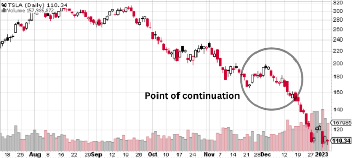
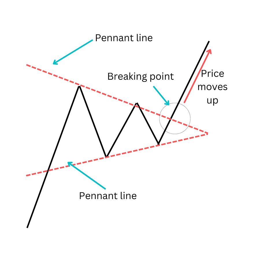
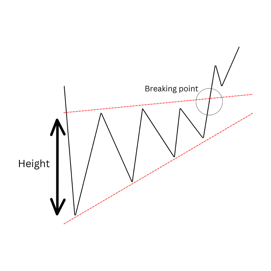
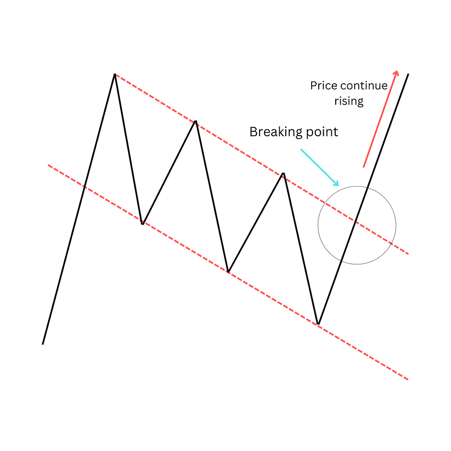
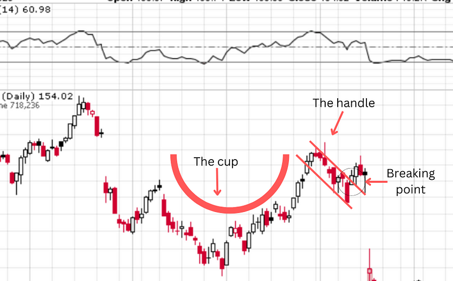
Reversal refers to a chart pattern that indicates the possibility of the chart going the other way. For example, if the chart is currently going up, upon reversal, it may go down in the future, and if it is currently going down, the price might go up.


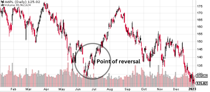
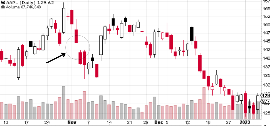
The picture above shows how Apple’s stock reversed from going down to moving up again. If you can master the skill of reading charts, you might be able to predict when the price might go up or down, so that you can place your trade at the most opportunistic time.

However, keep in mind that nothing is assured, it’s just that the market usually moves in a certain pattern which is usually predictable.

Continuation

A continuation pattern is where the pattern indicates that the stock price may continue the trend it’s currently in. For example, if the stock is going down, upon continuation pattern, the price is likely to continue going down. If you have your money placed there, you may want to consider moving it elsewhere.


Take the example above, Tesla’s stock can be seen to rise a bit, but upon reaching a certain point, it continues plummeting.

Different types of patterns under the two

Before we go any further, let us tell you that there are actually way lot more of these patterns out there, we are just giving out a few of the common ones.

Reversal

1. Head & shoulders


The head and shoulders pattern is where there are three ‘mountains’ where the middle one (the head) is the tallest and the two mountains surrounding it are almost at the same peak.

What this trend usually shows is that the stock tried to push up but failed, and eventually falls down as investors start to lose confidence. Why this pattern considered a reversal is because it moved away from the previous uptrend (three mountains going up) to a falling price.

What you need to observe for this pattern is the neckline or the baseline which is located at the ‘base’ of these three peaks. If the price moves below the neckline, that is what we call a breaking point — where all hell breaks loose and the trend starts to change.

Do note, that there is also an inversed Head and Shoulders. It is where the downtrend reverses into an uptrend. Just turn the graph above upside down to get a picture of it.

2. Double top and bottom

The double top looks like an “M” and the double bottom looks like a “W”. For the double top, the chart has two equal or almost equal peaks. For this type of chart pattern, you draw a baseline according to the ‘valley’ or the lowest point of the pattern. Once the price goes below the baseline, it’s the breaking point where the trend will go in a different direction (in this case, it goes down).

As for the double bottom, it’s the same as the double top above, it’s just inverted. Nonetheless, for the sake of it, we have also included the picture below to give you an illustration of what it looks like.


3. Gaps

Gaps refer to the state when the market closes for the week, the next opening price moves up or down in a remarkable amount, creating a ‘gap’ between the last price (when the market closed) and the opening price (when the market reopens again).

There are around 4 types of gap patterns: common, breakaway, runaway, and exhaustive.

However, to explain all that we wrote another article here.

. Nonetheless, putting it simply:-

Common gap: where the gap is of no significance.

Breakaway: Indicates that a new trend is coming.

Runaway: Indicates a trend that is already there and is still going well.

Exhaustion: A sign that a trend is about to end.

Continuation

1. Pennant


Pennants are a trend which appears like two converging lines, either moving upwards or downwards. It shows a trend buildup which makes many people anticipate the outcome (usually continuing the current trend). At this point, usually, the trading volume gets smaller and smaller.

Once the breaking point is passed, and a continuation is likely, you can usually see the trading volume will increase.

Do note, that you may get this confused with the triangle pattern, but pennants are usually:

  • Followed by a huge spike or huge fall that resembles a flagpole, if there is no flagpole after the trend, then it’s a triangle.
  • Pennants usually consist of the lesser candle (if you use a candlestick chart) than triangles, in which pennants usually have fewer than 30 price candles.

2. Triangles


A triangle chart is quite similar to the pennant and wedge, with a few differences — of course. The difference between a triangle and a pennant is mentioned above, while the difference with a wedge is mentioned below.

Now, what a triangle pattern usually means is that there will be a continuation of the trend, be it upwards or downwards.

If you see the picture above, there is a “height” label, which is usually forecasted to represent how much the price will continue to rise or fall after reaching the breaking point (technically, it’s a continuation point).

However, it is important for you to know that there are three types of triangle patterns. Worry not, we will prepare one whole new article just to specifically touch on the triangle pattern.

Here is a brief on these triangle patterns:

Ascending: The trend moves upwards.

Descending: Trend moves downwards.

Symmetrical: The trend can move either way, depending on which side it breaks out from.

3. Wedge


The wedge looks like pennants and triangles, but the direction of a wedge is either upwards or downwards. Simply, it’s not same, but same, but not same.

What a wedge does is that it usually predicts a continuation pattern. Similar to the pennant, the volume will get smaller as the pattern builds up.

There’s nothing too significantly different about the wedge, other than that it doesn’t really show a breaking point. A wedge pattern is more like a tunnel moving in an up or down direction.

4. Flag


Flag pattern can be identified by the two parallel trend lines, whereby if the price move above the breaking point, there is a likeliness that the price will continue moving up.

5. Cup and Handle


The cup looks like a teacup with a handle. Of course, one might argue that it only looks like a teacup if it is used by the lord of darkness himself but we aren’t going to argue about aesthetics.

The cup pattern is a continuation pattern whereby as you can see above, the graph went into a curve, before falling down again (at the “handle” part). The most important part of this graph is the handle, which provides the breaking point for the trend. The trade volume would usually decrease as the pattern is in progress.

From the picture above, we can see that the price went over the breaking point, and at that point, it is likely that it will continue rising.

There are a few tips while looking for the cup pattern:

  • A U-shaped cup usually is a better and safer bet than a V-shaped cup.
  • The handle ideally should be around 1/3 of the cup’s depth.
  • There is also an inverted cup! Just turn the image above upside down.

Key Takeaways

  • Patterns usually identify two things: continuation and reversal.
  • A reversal pattern usually indicates that the trend will move the other way.
  • Continuation patterns usually would mean that the trend will keep on going as it was.
  • Important: nothing is certain, these are only estimates based on usual patterns.

Do keep an eye out for our posts by subscribing to our channel and social media.

None of the material above or on our website is to be construed as a solicitation, recommendation or offer to buy or sell any security, financial product or instrument. Investors should carefully consider if the security and/or product is suitable for them in view of their en
tire investment portfolio. All investing involves risks, including the possible loss of money invested, and past performance does not guarantee future performance.

Become a AXEHEDGE investor today.