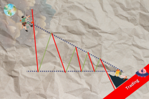
AXEHEDGE

Risk Management: Forecasting your portfolio returns (Part 2)

How to see the range of your portfolio returns and take the best risk.

Important: Recap and sheet download link

This is what we’ve discussed so far:

Before we start, under the topic of Risk Management, we have looked at these things:

The calculations herein will be based on the calculations that we already had in our previous articles. You can download our MS Excel file if you want.

Forecasting the range of your portfolio returns

Previously, we looked into the average daily return of each stock and used those numbers alongside the weights of each stock in the portfolio to forecast the annual expected return for the portfolio. To refresh on what we have got so far, here are the values needed for our calculations later that we’ve already established:

Annual portfolio forecasted return: 41.65%

Number of trading days for the year (in the US): 250 days

Portfolio variance: 1.81%

What we want to do now is look for the upper and lower range from that 41.65%. Why?

  • Because stocks can move up and down.
  • What you forecast isn’t always what you get.
  • Instead of putting your bet on a single number, a prudent investor would entertain the probability that their investment will move in a certain direction — be it up or down.
  • Instead of locking your ‘bet’ in a number, entertaining the possibility of it moving along the range will save you from disappointment and help you make better choices.

A bit on standard deviation

Image source: By M. W. Toews — Own work, based (in concept) on figure by Jeremy Kemp, on 2005–02–09, CC BY 2.5, https://commons.wikimedia.org/w/index.php?curid=1903871

For those who are familiar with the concept of standard deviation, can just skip this part. As basics for those who aren’t, standard deviation is a statistical concept that summarizes an interesting pattern in nature — which is the graph above!

What? Alright, so the graph above is a very common occurrence when you try to collect data from something random.

Say, you look into the math test results of every third grader in the US. There would be a few high scorers (the right-most section of the graph), and there would be some who score somewhat very low (the left-most section of the graph), but most would score the average, which is at the middle part of the graph.

The same goes for the movement of stock prices. Based on the historical data that you use, you can predict the range of the price movement, despite its randomness. What we’re trying to do is to look for the range of the price movement and the likelihood of it.

Here are the tiers of likelihood for each part in the graph above:

Tier 1 (-1σ to 1σ): 68.2% likely to happen.

Tier 2 (-2σ to 2σ): 95.4% likely to happen.

Tier 3 (-3σ to 3σ): 99.6% likely to happen.

99.6% is almost very accurate, right? But that might not be the best choice, and we’ll explain that later in the article. We’ll get to the calculation process first.

Step one: Look for the annual portfolio variance.

Here’s the formula:

Annual portfolio variance = Portfolio Variance * Sqrt (Number of trading days for the year)

We already have the value per mentioned before, so:

Annual portfolio variance = 1.81% * Sqrt (250)

Annual portfolio variance = 28.62%

Step two: Use the annual portfolio variance to see the range of portfolio returns.

Based on what we established, the annual portfolio forecasted returns are 41.65%.

What we want to do is how far away will the returns sway from this 41.65% (to see the standard deviation).

So, here’s how you calculate the standard deviation into the returns:


Tier 1

Upper tier = Annual portfolio forecasted return + (Annual portfolio variance * tier of standard deviation)

Lower tier = Annual portfolio forecasted return — (Annual portfolio variance * tier of standard deviation)

In this case, it’s tier 1, so we’ll multiply the Annual portfolio variance by 1. If tier 2, multiply it by 2, and so on. So here goes:

Upper tier = 41.65% + (28.62% * 1)

Upper tier = 70.27%

Lower tier = 41.65% — (28.62% * 1)

Lower tier = 13.03%

So, what we can say is that there is a 68.2% chance that the portfolio can go as high as 70.27% or grow as low as 13.03%. Doesn’t seem quite bad, does it?


Tier 2


Upper tier = 41.65% + (28.62% * 2)

Upper tier = 98.89%

Lower tier = 41.65% — (28.62% * 2)

Lower tier = -13.52%

What we can say is that there is a 95.4% chance that the portfolio can go as high as 98.89% or make a loss of -13.52%.


Tier 3


Upper tier = 41.65% + (28.62% * 3)

Upper tier = 127.51%

Lower tier = 41.65% — (28.62% * 3)

Lower tier = -42.14%

What we can say is that there is a 99.6% chance that the portfolio can go as high as 127.51% or go crashing with a loss of -42.14%.

Mind you: when we say there’s a 99.6% chance of it happening, we mean that there is a higher likelihood that your returns would be somewhere in that range. It doesn’t mean that you’re more likely to make higher or lower returns. It’s quite like shooting at a target — the bigger the target, the more likely you are to hit it. It doesn’t mean you’re a sharpshooter, it’s just that the target is easier to hit.

So, what do you do with the information?

Here’s the thing tho, making the standard deviation bigger (moving to Tier 2 or Tier 3) doesn’t always mean that it’s good. Of course, there’s a higher likelihood that your portfolio can hit the spot, but this is like casting a huge net and then bragging when you get some fish. It’s not because you know how to fish, it’s just that your net is enormous, it takes in everything, including fish.

When investing, you don’t want to be dealing with a range too big, because you need some accuracy for your predictions. How would these estimates be of any use then?

The key to see if your portfolio’s expected earnings are good or not is by seeing where the bell curve lies. How does that work? Well, in a normal situation, you’d expect a 50–50 situation, where if the lower band is -10, the middle one is 0, and the upper band is 10, like the image below (which is kinda ugly, sorry).

The image above is a normal situation. If we look at it in a sense of risk-taking, you bet $10 so that you can either gain or lose $10. It’s a ‘fair’ 50–50 game. In our portfolio’s case, however, it looks more like this:

Right now, the middle point is no longer zero, which means that the curve has moved to the right. To understand this, we’ll move away from finance and look at this simple example:

Students from 4 schools will answer the same examination paper. Assuming that each school performs in a way that fits the bell curve pattern, can you identify the school that performs the best?

The answer is that School D is most likely the best school when it comes to the examination that they just had. Why? Because most of its students score on average more than other schools’ average. Their lowest band is at around 60%, which means that their students are quite the brainy bunch.

However, take note:

  • This is only a forecast, and it’s only based on historical performance data. Future performance might be different, and no one can really see into the future. It’s part of the risk you’ll have to take.
  • The amount of data you take in will also have to depend on your goal with the portfolio. Do you aim to sell only after 5 years, 10 years, or 30 years? If you take only a small sample of price movement data for a 30-year period, you might not get an appropriate forecast, and vice versa.
  • The whole purpose of this is so that you can minimize your risk, not escape it completely. There’s no investment without risk. Even investing in bonds has its risks, despite being very minimal. The chance of you getting killed by a cow in the middle of the sea can be very low, but never zero.

Bottom Line

  • To see the upper and lower band for your expected portfolio returns, you’ll have to use the concept of standard deviation.
  • Standard deviation is a statistical concept reflecting patterns in random data, illustrated by a bell graph.
  • Likelihood tiers: Tier 1 (68.2%), Tier 2 (95.4%), Tier 3 (99.6%).
  • Calculations: Step 1: Obtain annual portfolio variance using a formula. Step 2: Use the annual portfolio variance to calculate the upper and lower tiers for portfolio returns.
  • The more your bell curve is skewed to the right (relative to 0), the more likely it is that you’re taking a risk for a better return.
  • A larger standard deviation (Tier 2 or Tier 3) doesn’t necessarily indicate a better situation.
  • It’s only a forecast based on historical performance data. Future performance might be different, and there is no 100% guarantee.
  • The amount of data you take will play a role in how it turns out, and only consider data relevant to your time frame (not too much nor too little).
  • The whole purpose of this exercise is to minimize risk and not to erase it completely, as there would be no significant returns without risk.
  • Look at other indicators of risk as well, such as the Portfolio Variance, Sharpe Ratio, Beta, and more.

The key takeaways/market update is a series by AxeHedge, which serves as an initiative to bring compact and informative In/Visible Talks recaps/takeaways on leading brands and investment events happening around the globe.

Do keep an eye out for our posts by subscribing to our channel and social media.

None of the material above or on our website is to be construed as a solicitation, recommendation or offer to buy or sell any security, financial product or instrument. Investors should carefully consider if the security and/or product is suitable for them in view of their entire investment portfolio. All investing involves risks, including the possible loss of money invested, and past performance does not guarantee future performance.

Written By

BECOME AXEHEDGE INVESTOR TODAY